Assignment examples
Self portrait
Create a visual self-portrait to introduce you at the web. It
must contain your face and elements that are important for you, define
you, complement your visual image or inform the world about you.
The self-portrait must symbolize you, represent your identity and express
what you want to convey
about yourself.
The viewer must find your skill
and your spirit there.
Use a digital photo or scanned photo of yourself as a base for your work.
Use Photoshop techniques to add other elements of your choice through collage
and photocomposition.
Be interesting, subtle, rigorous and experimental. Think about who and what
you are and how you can express that visually.
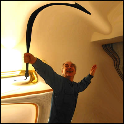
Edit work
Photograph
as many as possible
of your art works.
Bring them to digital format and modify them
in Photoshop
to make them look better. You can change texture, light, perspective,
background, scale, etc.
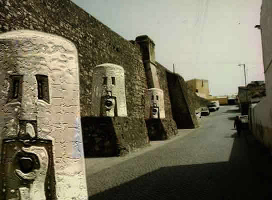
The purpose is to make your work look glorious, like for example
a tiny piece
looking like a monument
by overlapping
with a landscape.
Do the same with your digital work
Logo
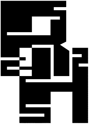
Create a logo representing yourself or your company or studio.
This logo should be all black (or monochrome if you prefer). You will
be given 2 squares and a grid. There you must design the 2 roman initials
of your name (first name and family name) one in each square. All lines
in your design must be straight lines, no curves allowed. All vertical
and horizontal lines must rest on grid lines and all vertices must rest
on grid points. Diagonals must run between grid points.
After you finish your initials combine them using pathfinder functions
to create your logo. Use Illustrator.
Example by Ryosuke Harashima.
Patterns
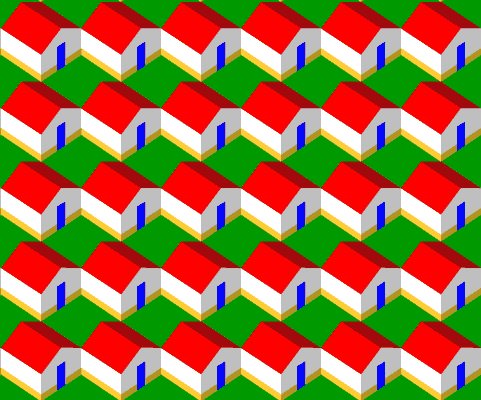
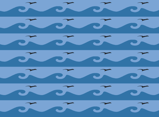
Using Illustrator’s pattern function, create 2 repetition
patterns.
You can think of them as wallpaper, fabric or a background
for your web page.
Pattern 1. Basic shape: square. Elements: squares, rectangles, circles
and triangles, maximum 3 each. They can overlap and be combined with pathfinder
or be masked by the basic shape. Use no more than 4 colors. Decide between
harmony and contrast as technique for your composition, and be clear about
it.
Pattern 2. Basic shape: rectangle. Elements: Bezier curves as closed shapes,
maximum number of curves is 3. Color: use no more than 3 shades of gray.
Black and white can be 2 of them.
Consider that patterns will be continuous so the way they connect left
and right, top and bottom is very important.
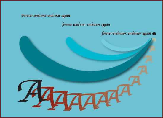
Poem
In Illustrator
create a lay-out page with a short poem in English illustrated with a
blended structure using a shape (geometric or Bezier curve) and a letter
reduced to outlines. Use a grid of your own choice for this composition.
Don’t use more than
5 colors.
